
Website navigation serves as a pivotal element in shaping the user experience and driving engagement. It acts as the roadmap guiding visitors through your online presence. In this comprehensive guide, we will delve into the core elements of effective website navigation. We’ll also explore best practices and advanced techniques to help you create a user-friendly, engaging, and ultimately successful online platform.
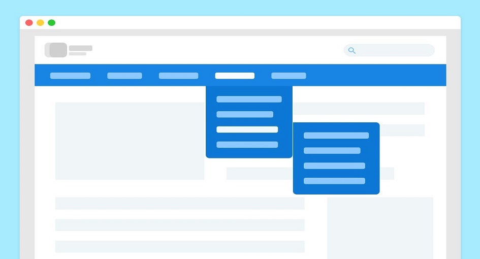
The cornerstone of a successful site navigation system is a menu that is clear, intuitive, and user-friendly. It should provide a practical guide for your visitors, helping them easily find their way around your site. Primary menu items, such as Home, About, Services or Products, Blog, and Contact, should be straightforward and easily understandable.
In today’s digital landscape, responsive design is an absolute necessity. It ensures a seamless user experience across various screen sizes and devices. Your navigation should adapt effortlessly, providing a consistent user experience, whether visitors access your site from a desktop, tablet, or smartphone.
To prevent user confusion, it is vital to maintain a consistent navigation layout and style across all pages of your website. Whether it’s the placement of the menu, the styling of links, or the organization of menu items, uniformity is key.
Ensuring your website is accessible to all users, regardless of their abilities, is a fundamental requirement. This involves adhering to accessibility standards and ensuring compatibility with assistive technologies, making your website navigable for everyone.
A user-centered design approach is essential. To understand your target audience’s preferences and expectations, conduct user research, such as surveys and testing. This allows you to tailor your menu to their needs and expectations.
A concise menu, including only the most essential items, simplifies decision-making and ensures that users can quickly access the information they seek.
Enhance visual clarity by using cues like dropdown menus, sub-menus, or icons, offering additional navigation options without cluttering the primary menu.
Descriptive labels for menu items are vital for clarity. Specific and informative labels help users anticipate the content they’ll find when they click.
Breadcrumbs are particularly useful for large websites with deep content structures. They provide users with a trail to retrace their steps, aiding navigation.
For content-rich websites, incorporating a search bar is invaluable. It allows users to locate specific content efficiently.
Ideal for expansive websites, mega menus offer a wide array of sub-options, simplifying access to diverse content.
Implementing sticky menus that remain visible as users scroll down the page ensures quick access to different sections of the site.
Content-heavy websites benefit from pagination and load more buttons. These features help organize and display content effectively without overwhelming users with excessive information.
Organize content into visually appealing cards, making it perfect for showcasing various content types.
Recognizable by the three horizontal lines, hamburger menus offer a space-saving solution, particularly suitable for minimalist and mobile-friendly designs.
This dynamic navigation feature highlights the menu item corresponding to the visible content on the screen, enhancing the user’s understanding of their position on the page.

A well-executed navigation system profoundly influences your website’s success. It leads to improved user satisfaction, reduced bounce rates, enhanced SEO, increased conversions, better content discovery, and a positive brand image. It prioritizes mobile-friendliness, accessibility, and inclusivity, ensuring all visitors can engage with your content.
Your website’s navigation is the roadmap to your brand’s digital presence, and by perfecting it, you’re well on your way to digital success. Simplicity, user-centered design, and inclusivity are the pillars of effective site navigation, guiding users seamlessly through your digital landscape and leaving a lasting, positive impression.
In conclusion, the foundations of effective website navigation underscore the importance of simplicity and user-centric design. Clear and intuitive menus, responsive design, consistency across pages, and a commitment to accessibility and inclusivity lay the groundwork for an exceptional user experience.
Best practices for streamlined navigation emphasize the significance of user-centered design, limited menu items, visual clarity, descriptive labels, breadcrumbs, and search functionality. These practices simplify user interactions and empower them to find the information they seek swiftly and effortlessly.
Advanced navigation techniques take your website to the next level, offering mega menus, sticky navigation, pagination, card-based navigation, hamburger menus, and scrollspy navigation. These dynamic features enhance the user’s journey and elevate their understanding of your website’s content.
Effective site navigation yields a profound impact on your website’s success. It translates to improved user satisfaction, reduced bounce rates, enhanced SEO, increased conversions, better content discovery, and a positive brand image. Mobile-friendliness, accessibility, and inclusivity are cornerstones of this success, ensuring your website is accessible to all users, regardless of their abilities.
